Working with Charts
Charts (or graphs) are graphical representations of your data. Kinabase makes it very quick to pull together various different charts, allowing you a better understanding of your data.
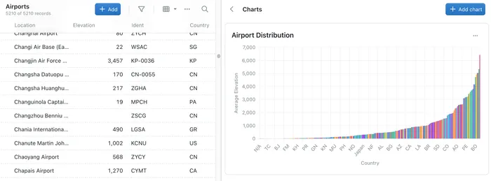
- From the Sidebar, select the Collection that contains the relevant data.
- On the top navigation bar, click the charts button (a pie chart icon). This will open the Charts side panel.
- Click the Add Chart button to generate a new chart.
- You should now complete the fields displayed. The exact fields that you complete may depend on the type of data you have available in your Collection, and the type of chart you select.
Title
Enter the name that you want the Chart to have. Ideally it should describe what the chart is displaying e.g. Airports ranked by Elevation
Chart type
This is a dropdown field where you can select what chart you want. Possible options include Scatter, Line, Pie and Bar. Depending on the option that you select only some of the fields below may be availale.
X Axis Field
This is a dropdown list of all of the appropriate field from your Collection and will be plotted on the X (horizontal) axis.
Y Axis Field
This is a dropdown list of all of the appropriate fields from your Collection and will be plottd on the Y (vertical) axis.
Categorisation Field
Select the field that you want the chart to group or categorise the results by,
Categorisation Aggregation
If you are categorising your data then you can select how the display is calculated for each category. This dropdown provides you with options for Sum, Average, Count, Minimum and Maximum.
Categorisation Category Limiting
With large data sets the resulting chart display may be crowded and less than useful. To help, you can optionally limit the results to the top/bottom 3, 5 or 10 results from the calculation.
Weighting Field
If you are viewing a pie chart and are calculating anything other than count then this field will be the one used for the calculation.
When selecting some fields, you may see a warning that the category has lots of options. This means that the chart might take a while to generate or the results may look crowded. Try to avoid fields with large lists of options if you can.