Reporting

Understand your business better with custom reports and dashboards

Reporting
Reporting dashboard with charts and graphs
DATA VISUALISATION

Powerful reporting tools

Get the insights you need to make better decisions. Create custom reports and dashboards to track your business performance, and share them with your team.
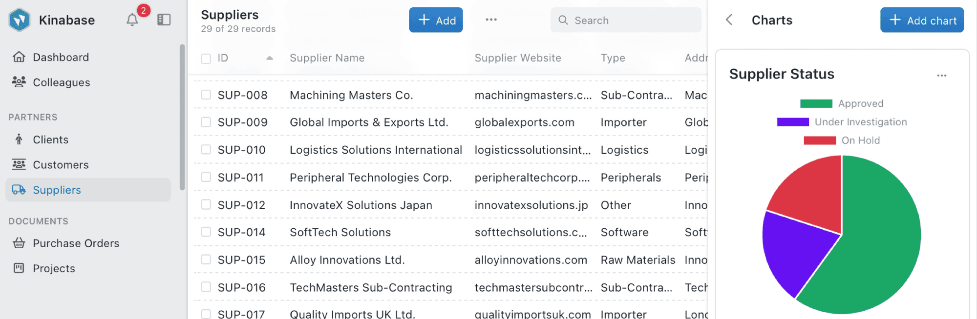
  • Custom charts & graphs

    Transform raw data into actionable insights with intuitive visualisation tools - from bar charts to maps.

  • Filter & group data

    Quickly filter, sort, and group your records to find exactly the information you need.

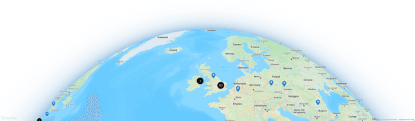
  • Geospatial visualisation

    Visualise your clients or supply chain geographically on interactive maps in seconds.

BENEFITS

Reporting enables you to...

Gain valuable insights from your data to drive better business decisions

Visualise your data

Create bar charts, line charts, pie charts, and more to track your business performance in ways that make sense to you.

Filter and sort with ease

Quickly organise data by client, date, or stage with just a few clicks to get the answers you need.

Share insights

Easily share reports with colleagues by creating quick links for seamless collaboration.

Track performance

Monitor key metrics and KPIs with custom charts to keep a pulse on your business activities.

Map your data

Visualise geospatial information to optimise logistics and plan client visits efficiently.

Use AI to get better insights

AI suggests the right charts and filters for your data, offering faster insights for your business.
Reporting dashboard with charts and graphs
COMMAND CENTER

Personal dashboard

Stay organised and on top of what matters to you. Start your day with everything you need, from what's next on your to-do list, to the latest activities across your projects—all in one place.
  • Task management

    See what's next on your to-do list and easily manage priorities from one location.

  • Activity feed

    Stay up to date with the latest activities from your colleagues across all your projects.

  • Calendar view

    Schedule your tasks and see what's coming up next with your personalised calendar.

Visualisation Options

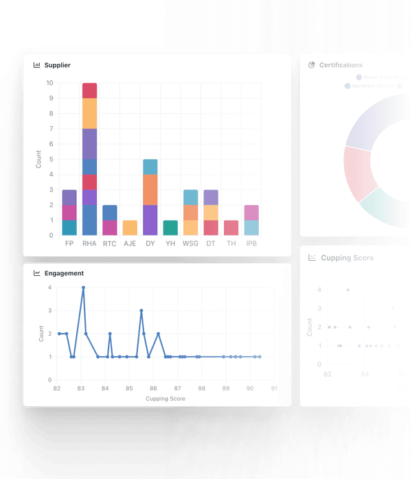
Powerful data visualisation tools

Choose from multiple visualisation types to best represent your data and uncover valuable insights

Bar charts

Compare values across categories with customizable bar charts.

Line charts

Track trends over time to identify patterns and forecast future trends.
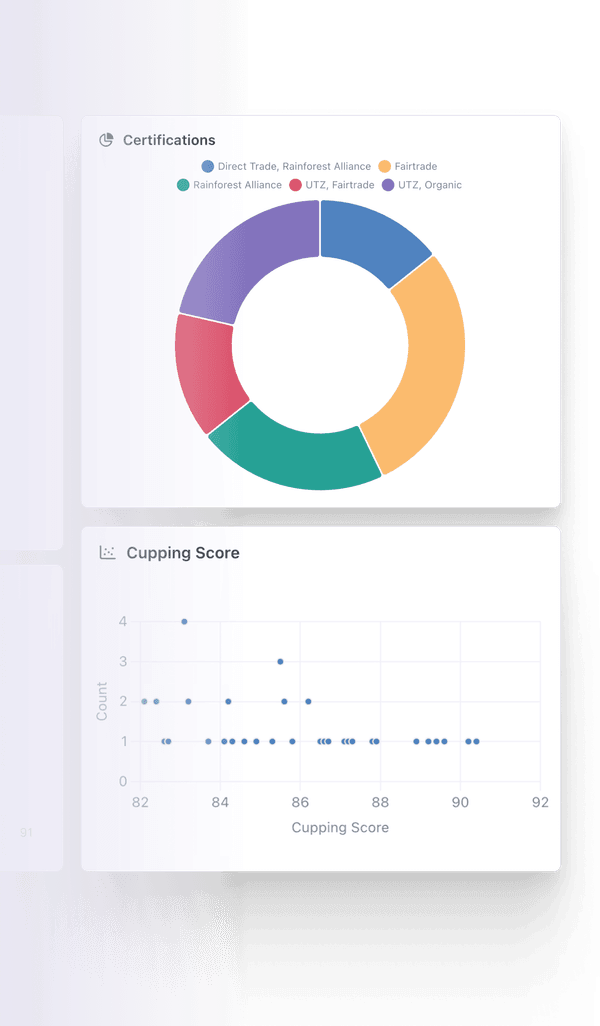
Pie charts

Visualise proportions and percentages within your dataset.

Maps

Plot your data geographically to see regional patterns and opportunities.

Map Visualisation
Background image

Ready to gain valuable insights from your data?

Start using Kinabase reporting tools to make better business decisions
FAQs

Frequently asked questions

How easy is it to create custom reports in Kinabase?

Creating custom reports in Kinabase is designed to be intuitive and user-friendly. The visual report builder allows you to select the data you want to analyse, choose appropriate visualisation types, and apply filters without any coding knowledge.

Can I share reports with my team?

Yes, Kinabase makes it easy to share reports with your team members. You can create saved report views that others can access, set up automated report distributions, or export reports to common formats like PDF or Excel for sharing outside the system.

What types of visualisations are available?

Kinabase offers a wide range of visualisation options, including bar charts, line charts, pie charts, maps, tables, and more. Each visualisation type is optimised for specific types of data analysis, helping you present your information in the most insightful way.

Can I create dashboards with multiple reports?

Yes, Kinabase allows you to create custom dashboards that combine multiple reports and visualisations on a single page. This gives you a comprehensive view of your key metrics and helps you monitor different aspects of your business at a glance.