Turn your data in meaningful charts and graphs in just a few clicks. Kinabase makes adding data easy - and you can now visualise this valuable data into meaningful charts and graphs - in just a few clicks.
Adding a chart or graph to your data can help you to understand the bigger picture. There are many different options of chart types available such as; Scatter, Line, Bar and Pie Charts. The fields and configuration chart is based on your individual collections.
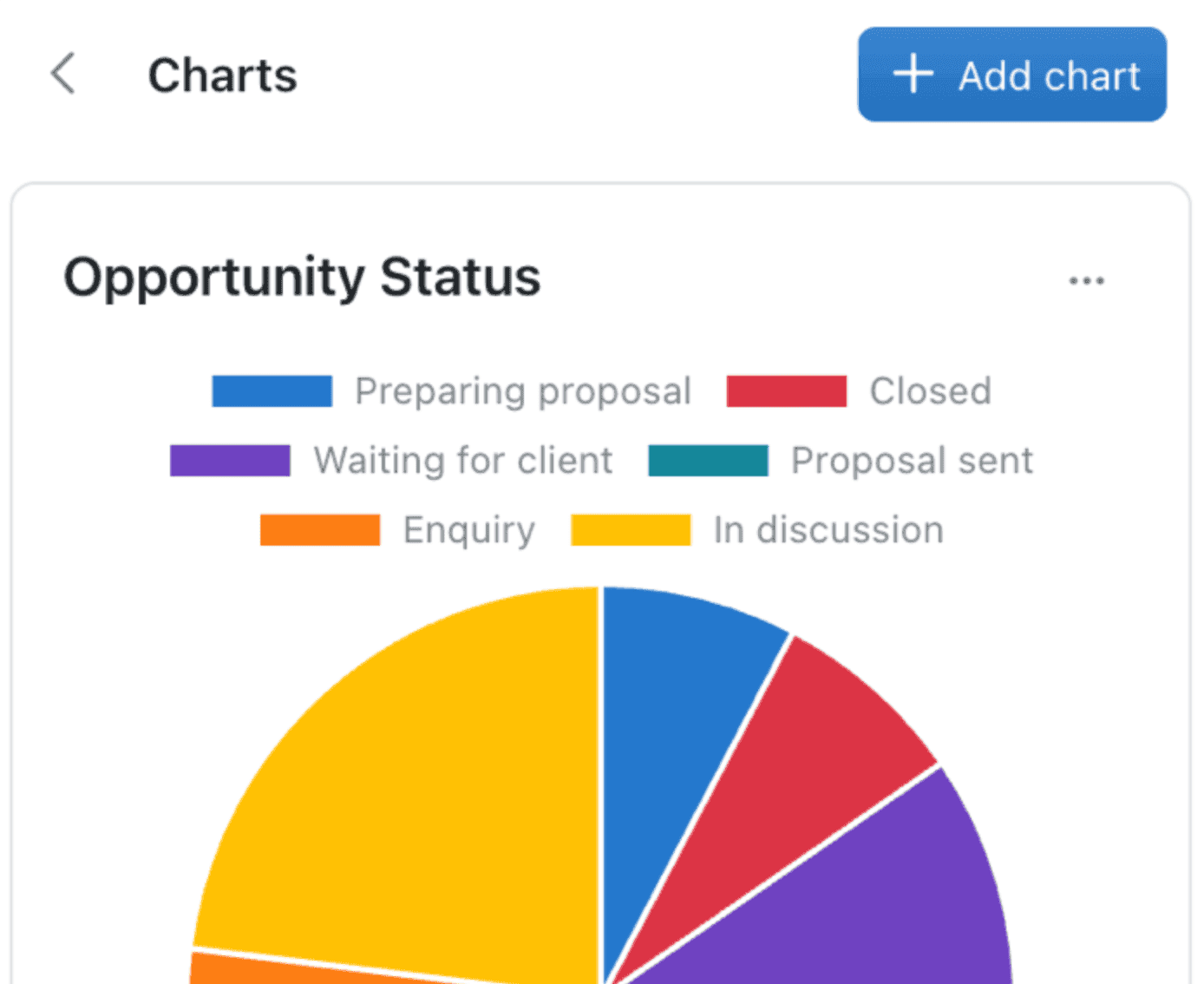
Charts can easily be added by clicking the chart button - found at the top of the collection. From here, you'll see any existing charts you've created and can also create new ones by clicking the blue Add chart button.
It's easy to try various combinations of options until you get it just right for your needs!