
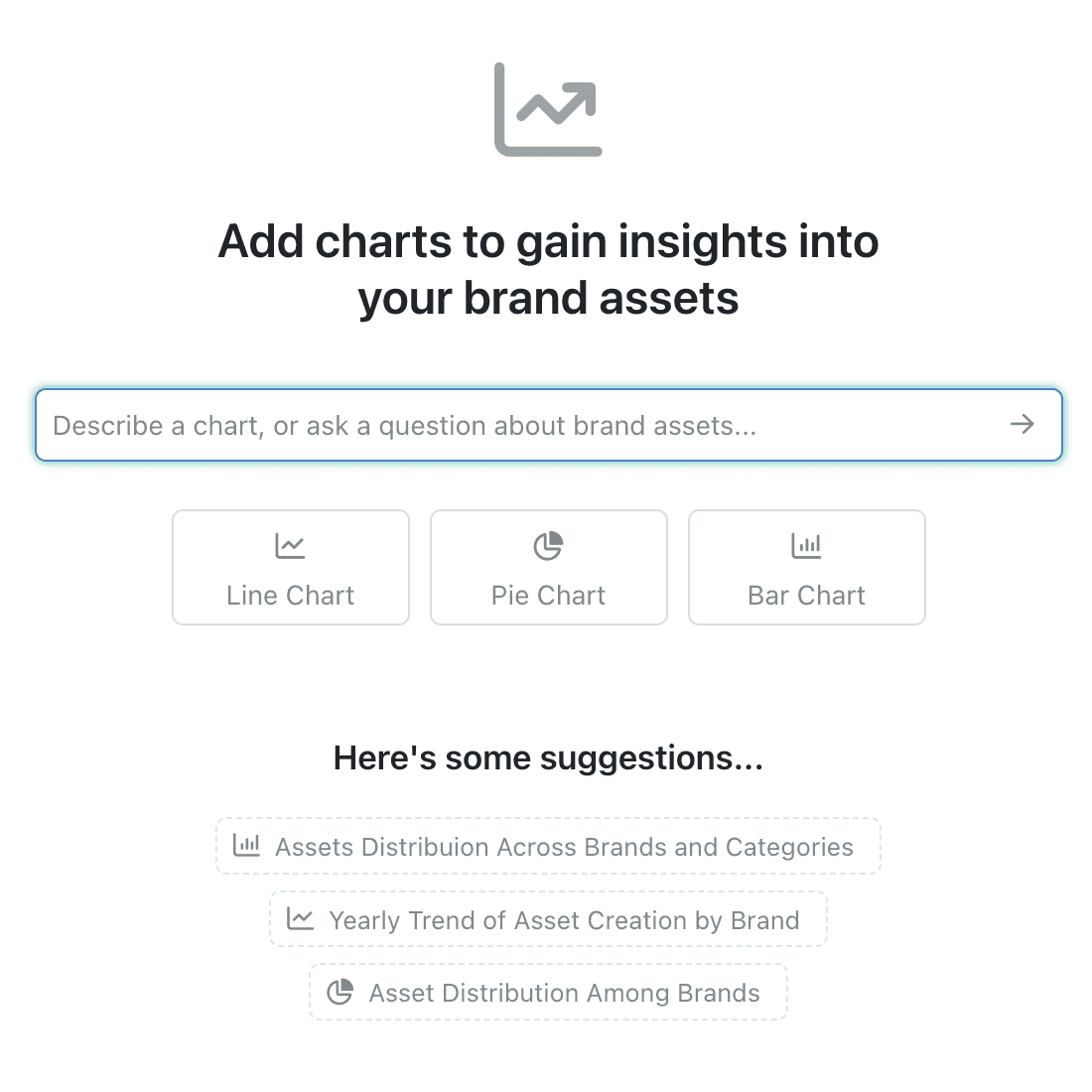
Kinabase's new update makes creating charts faster and smarter. Simply type a question or describe the chart you need, and our AI-powered tool will generate it for you instantly. You can also explore AI-suggested charts tailed to your data, helping you uncover key insights at a glance.
How to Use AI-Powered Charts:
- Open Your Collection
- Navigate to the collection where you want to add charts.
- Access the Charts Tool
- Click the charts icon in the toolbar at the top of your screen.
- Describe or Select
- Type what you’d like to see (e.g., “Show quarterly sales by region”), or choose from pre-suggested charts based on your data.
- Save and Customise
- Your charts update in real time and stay saved in the collection. Resize or rearrange them to prioritise the most important data.
Pro Tip: Add charts to your reports dashboard via the options menu (⋯) for a seamless reporting experience.
Why It Matters:
This update combines powerful AI with seamless usability, giving you:
- Save Time: Generate charts instantly — no technical skills required.
- Uncover Insights: AI suggestions highlight patterns you might miss.
- Stay Updated: Real-time charts ensure you’re always looking at the latest data.
With this feature, you can visualise and manage your data effortlessly, right in Kinabase.
Turn data into actionable insights with smarter, AI-powered charts.