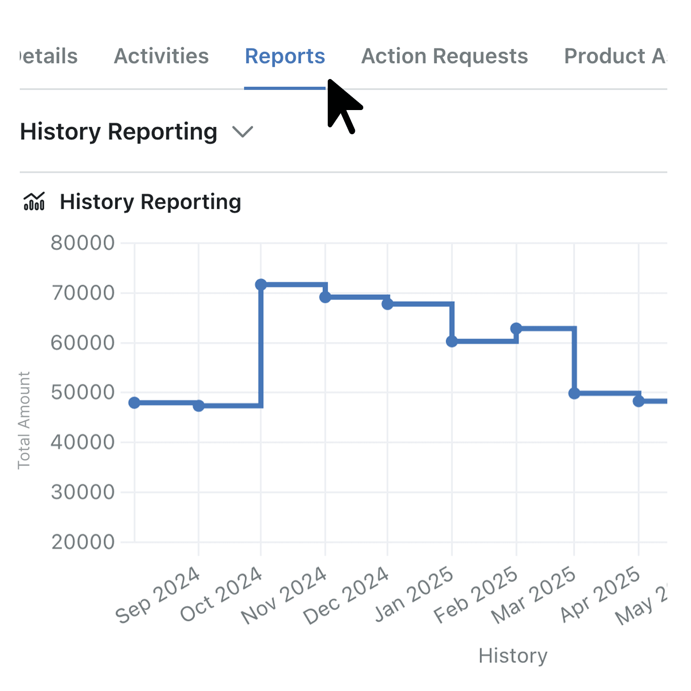
Historic trend charts now live inside every Record, so you can spot patterns in a single glance and act before issues snowball.
Quickly view a record’s past activity, understand the pace of change and share the insights in Portals – all without extra filters or duplicate dashboards.
Why it matters:
- Save time – stop cloning dashboards; Kinabase filters charts to the open Record automatically.
- Spot anomalies early – clear visuals highlight spikes, drops or stalls in activity.
- Share selectively – choose which charts surface in client Portals, keeping external users focused on what matters.
How it works:
- Open Collection → Configuration → Historic trends.
- Add up to five charts, picking chart type, metrics and time window.
- Tick the charts you want visible in specific Portals or in-app Record pages – we handle the filters.
When to use it:
- Account managers tracking engagement on a single client Record.
- Operations leads monitoring temperature or sensor readings for one asset.
Try it now in Kinabase → Collections. Have feedback? Email support@kinabase.com — we’re listening.