Your dashboard just got clearer. You can now set Top or Bottom limits on any Kinabase Chart, automatically grouping the remaining data into a single “Other” bucket so you spot the big hitters instantly.
Forget scrolling through overcrowded bar-charts or tiny pie-chart slivers. With concise categories and a tidy “Other” slice, decision-makers focus on what matters and act faster.
Why it matters:
- Cut the noise – shrink a 50-item bar chart to a focused Top 10 in seconds.
- Spot trends sooner – surface outliers and high performers without wading through minor entries.
- Share with confidence – cleaner visuals land better in meetings and emailed Reports.
How it works:
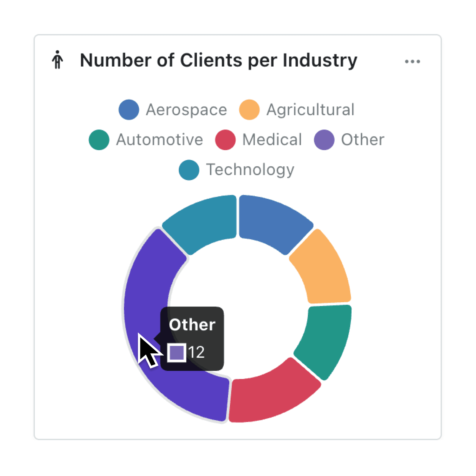
- Open any Chart and click the three dots ⋯ (in the top right) to Edit your chart.
- Scroll to the bottom of the chart editor & you will see 'Category Limit' option.
- Choose Top or Bottom and set the number of categories to keep (e.g. 3, 5, 10).
- Use the toggle to choose to 'Show Other'. This will group any of your minor values together into an 'other'.
- Click Update. The Chart refreshes, now showing the selected items plus one “Other” category for everything else.
When to use it:
- Sales Leads to highlight your Top 10 customers by revenue.
- Quality Engineers to show the Bottom 5 products by defect volume and take action.
- Project Managers to see which tasks have absorbed the most time.
Try it now in Kinabase → Dashboards → Chart Editor.
Have feedback? Email support@kinabase.com — we’re listening.