Analyse everything in one view. Our new multi-collection charts let you plot series from any collections side by side – no more spreadsheets or duplicate dashboards.
Compare sales, stock, and support tickets in a single graph by choosing the chart style, then selecting which data appears on the x-axis and y-axis for every collection. Faster insight means faster decisions.
Why it matters:
- Save time – build a single chart instead of maintaining three separate ones.
- Spot trends instantly – overlay numbers that used to live in different tabs.
- Different chart types – use bars, lines or scatters and choose the axis that makes sense.
How it works:
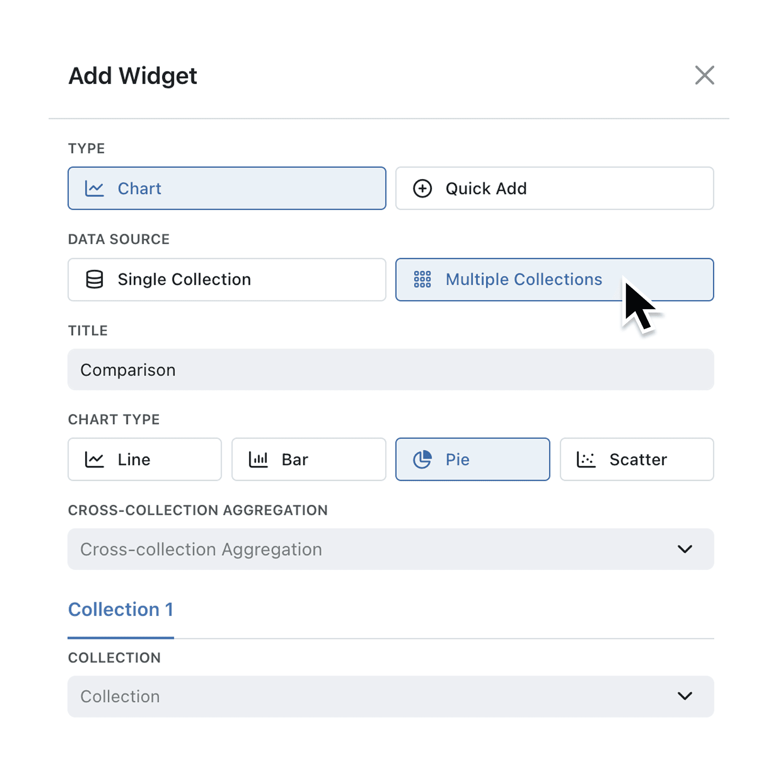
- Open any Dashboard and click Add Widget → Chart.
- Pick “Multiple Collections” as your data source.
- Give your chart a Title, and select the chart type.
- Set your cross-collection aggregation method (if appropriate). From Sum, Average, Max, Min, Standard Deviation, Cumulative Sum.
- Set your X & Y Axis Labels.
- Add your First Collection. And define your chart by selecting fields for each Axes, setting categorisation, aggregation, limits chart type and axis.
- To add your Second Collection Scroll back up and click the "+" add button, next to 'Collection 1'
- Select your Second Collection and repeat step 6 to define the chart.
- Check your chart details and hit Add at the bottom of the interface. Your chart will appear on the dashboard immediately.
When to use it:
- Operations Managers tracking orders shipped, returns and open tickets together.
- Continuous Improvement Engineers pulling disparate data to spot trends, such as combining temperature data with dimensional feature measurements.
- Founders viewing revenue, cash in bank and web traffic in one glance.
Try it now in Kinabase → Reporting.
Have feedback? Email support@kinabase.com — we’re listening.