Creating professional documents often means switching between Kinabase and a separate tool just to add a chart. You might export data, build a graph elsewhere, paste it into your template, and repeat the whole process every time the numbers change. That manual work slows you down and risks outdated figures reaching your clients.
What's New
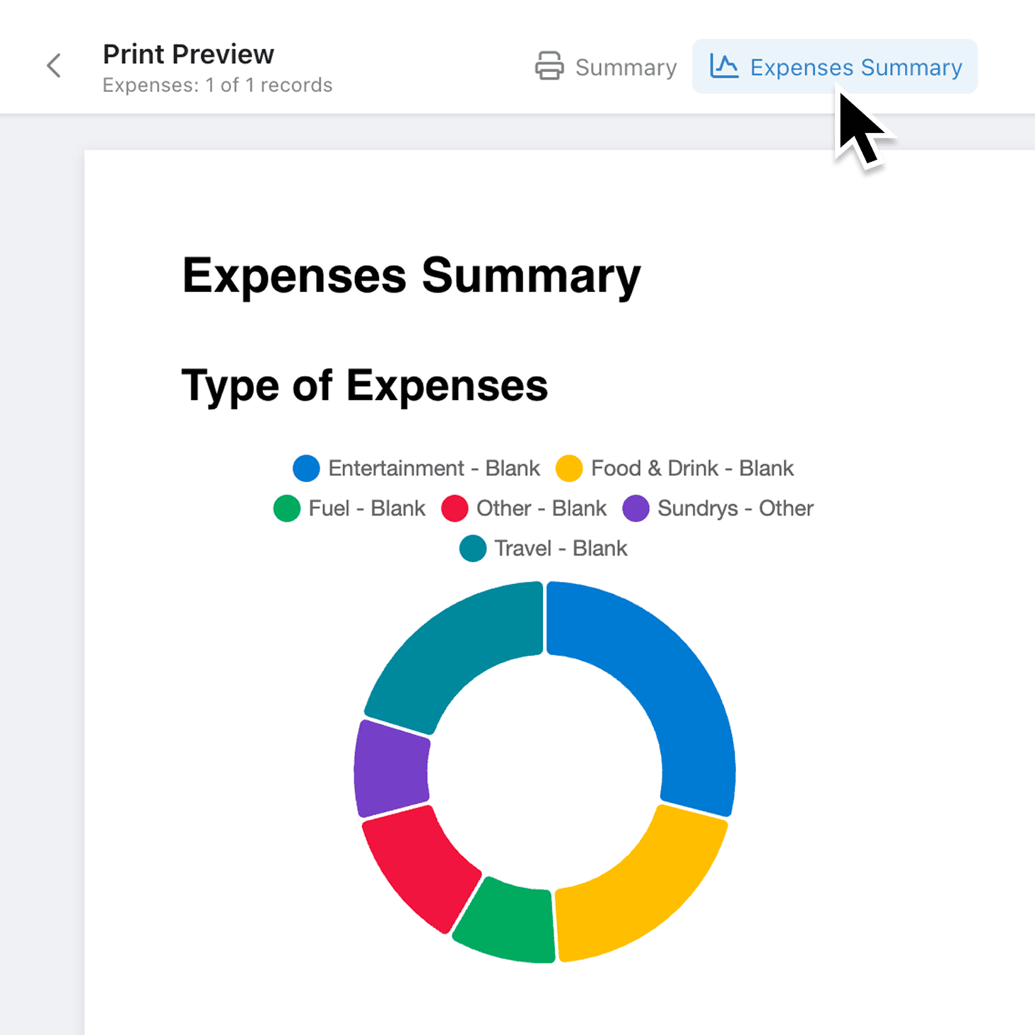
You can now insert charts from your existing dashboards and reports directly into document templates. When a document is generated, each chart pulls live data and renders as a crisp image, so your proposals, invoices, and internal reports always show the latest figures. Bar, line, pie, and scatter charts are all supported.
Why it matters:
- Eliminate manual chart exports by pulling visualisations straight from your dashboards into documents, removing copy-and-paste steps entirely.
- Keep documents accurate because charts render with live data at the moment a document is generated, so numbers are never stale.
- Maintain consistent branding since charts use the same colours and styles you have already configured on your dashboards.
- Control what data appears through built-in permission checks that only allow charts visible to everyone, preventing sensitive data from leaking into shared documents.
How it works:
- Open a document template in the Document Editor.
- Click the + insert menu in the toolbar and select Chart.
- In the Configure Chart modal, choose a report from the dropdown. Reports are grouped into Dashboard Reports, Record Reports, and Collection Reports.
- Select the specific chart you want to embed, then click Save.
- Resize or reposition the chart element on the page as needed. To change the chart later, select it and click Configure Chart in the Properties Sidebar.
Note for admins: only reports with "Everyone" read permissions appear in the chart picker. If a report is missing, check its dashboard permissions.
When to use it:
- Operations managers can build monthly performance packs that automatically include the latest throughput and efficiency charts, saving hours of manual assembly each reporting cycle.
- Sales teams can embed pipeline and revenue charts into client proposals, ensuring every prospect sees current figures without extra effort.
- Finance teams can add budget-vs-actual charts to recurring expense reports, so stakeholders always review the most recent numbers without chasing updated screenshots.
Get Started
Head to any document template, insert a chart, and see the difference live data makes. If you have not set up dashboard reports yet, create one first and your charts will be ready to embed. We would love to hear how you use charts in your documents, so do share your feedback with us.
If you have questions or feedback, we would love to hear from you. Email support@kinabase.com — we’re listening.