Make data-driven decisions in a few clicks and effortlessly get an overview of your data with the new bubble chart.
Data visualisation is an essential tool for businesses and individuals seeking to understand complex datasets and uncover valuable insights. Among the myriad of visualisation options, bubble charts stand out as a powerful and visually engaging way to represent multi-dimensional data.
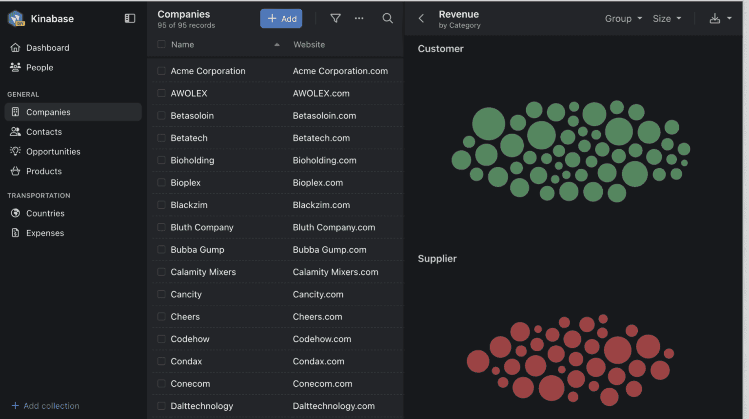
Kinabase intelligently shows the bubble chart in any collection with fields containing numbers or categories. This allows you to get an overview of your data at a glance, and quickly export as an image to your desktop for your next big presentation.
To give you an example, the below bubble chart shows one bubble per company, grouped by type, and sized based on the company revenue. From this, it's easy to see who the biggest customers and suppliers are.