When you build a bar or pie chart in Kinabase, the order your data appears in matters. A sales pipeline chart might require listing stages in order or a revenue breakdown from the largest to lowest value. Until now, charts sorted categories only alphabetically.
What's new:
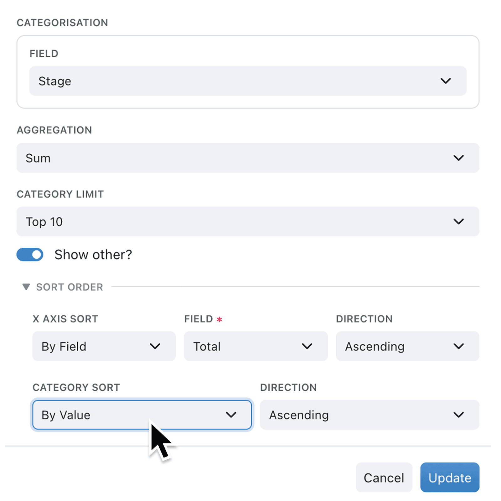
Bar and pie charts now include a Sort Order section in the chart setup panel. You can choose to sort your chart's axis by value, by a specific field in your collection, or leave the default ordering. For grouped bar charts, you can also control how categories within each group are ordered using the Category Sort row, giving you full control over both axes.
Why it matters:
- See your biggest numbers first by sorting chart values in descending order, so the most important data stands out immediately.
- Match your business process by sorting chart categories according to workflow stages, priority selections, or record types, keeping charts aligned with how your team actually works.
- Remove guesswork for viewers by presenting data in a logical, consistent order that anyone on your team can read at a glance.
- Configure once, use everywhere because sort settings are saved with your chart configuration and apply every time the chart is viewed on a dashboard or in a report.
How it works:
- Open a bar or pie chart in edit mode from your dashboard or report.
- Scroll to the Sort Order section at the bottom of the chart setup panel and expand it.
- Choose a sort mode from the X Axis Sort dropdown (or Slice Sort for pie charts): By Value sorts by the chart's measured values; By Field lets you pick a specific field to sort by. Leave it set to Default for standard ordering.
- If you selected By Field, choose the field you want to sort by from the Field dropdown. Only numeric fields (such as number, currency, rating, probability, duration, and metric) and enumerable fields (such as selections, workflow stages, and types) are available.
- Pick a direction from the Direction dropdown: Ascending or Descending.
- For grouped bar charts, repeat the process using the Category Sort row to control the ordering within each group.
When to use it:
- Operations managers reviewing workload charts can sort by workflow stage to see items progress left to right through their pipeline, matching the real-world process.
- Sales teams analysing revenue by region or product can sort bars from highest to lowest value, instantly highlighting top performers.
- Finance teams building pie charts of expenditure categories can sort slices by value so the largest costs are always presented first in reports.
Get started
Open any bar or pie chart on your dashboard and expand the new Sort Order section to start customising. Your sort preferences are saved automatically and apply wherever the chart appears.
If you have questions or feedback, we would love to hear from you. Email support@kinabase.com — we're listening.