Reading a chart and working out what different values mean could be daunting without visual cues, and a single glance at colour is faster than any calculation. Y-axis bands let you paint meaningful ranges directly onto your charts so the story jumps out immediately.
What's new:
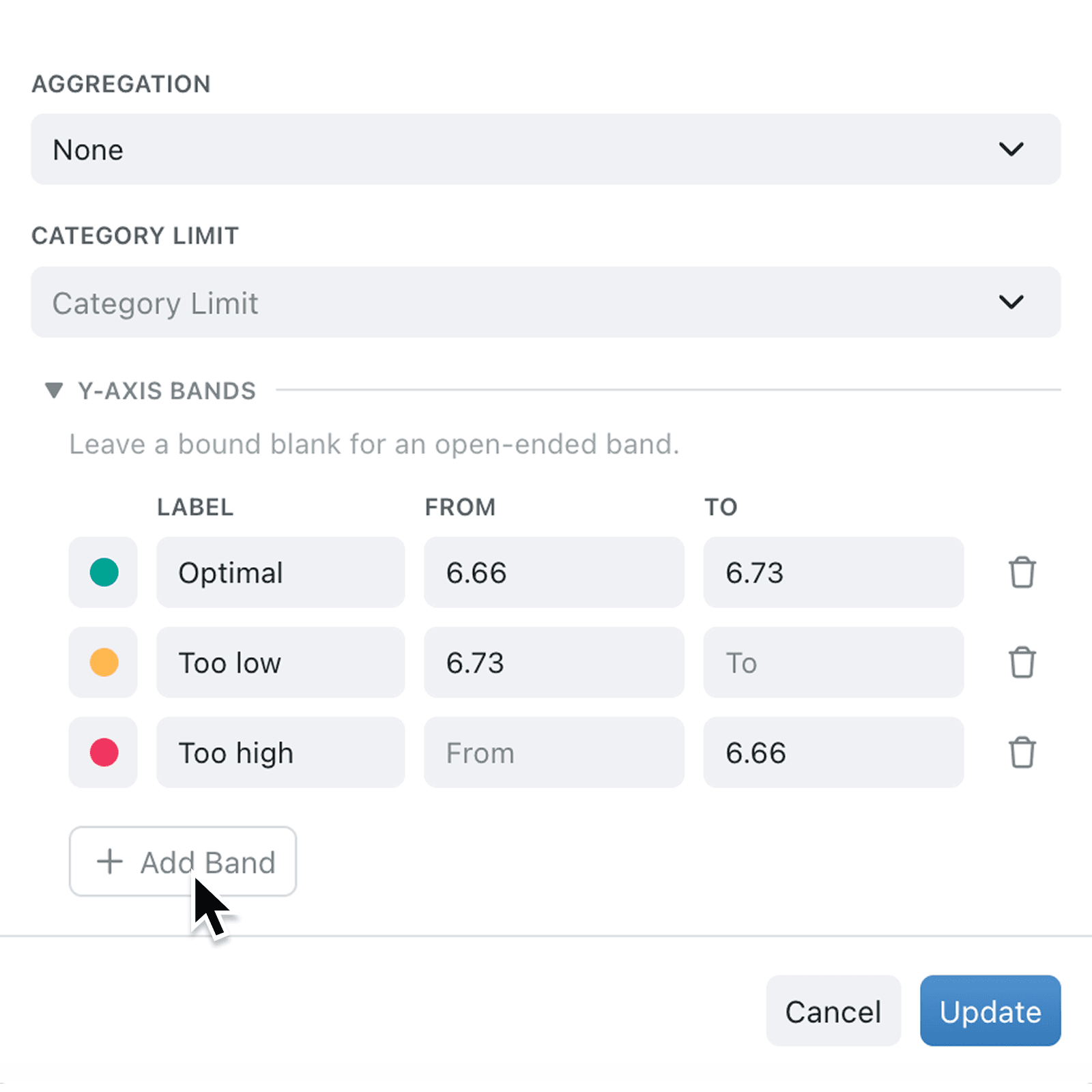
You can now add coloured background bands to the y-axis of line and scatter charts. Each band has a label, a colour, and From and To bounds, so performance targets, alert thresholds, and healthy ranges appear as soft tinted regions behind your data. Bands also carry through to chart exports and PDF reports, so the context travels with the picture.
Why it matters:
- Spot problems instantly with coloured ranges that communicate status before anyone reads a number.
- Match your operational language by choosing from the same semantic colour set used elsewhere, such as red for danger and amber for warning.
- Share polished reports because bands appear inside exported images, so PDFs and printed reports carry the same visual cues as the live view.
How it works:
- Open a line or scatter chart in your dashboard or report and choose Edit.
- Configure your chart as usual, then expand the Y-Axis Bands section at the bottom of the chart setup panel.
- Click Add Band and pick a colour, then set a Label and a From or To value. Leave either bound blank for an open-ended band that stretches to the axis edge.
- Repeat for each range you want to show, then save the chart.
- Review your chart to confirm the bands sit neatly behind your data, then refresh any report that uses it.
When to use it:
- Operations managers can shade healthy, warning, and critical ranges on an SLA line chart so the team sees status at a glance.
- Finance leads can mark budget ceilings and stretch targets on spend tracking charts, turning a flat line into a clear traffic light.
- Quality teams can highlight tolerance windows on measurement charts, making out-of-spec readings jump off the page.
Get started
Head to any dashboard or report, open a line or scatter chart, and try adding a band from the new Y-Axis Bands panel.
If you have questions or feedback, we would love to hear from you. Email support@kinabase.com — we're listening.