When you need to compare more than two variables side by side, a standard scatter or bar chart falls short. Until now, spotting the relationship between three variables, like deal value, close probability, and pipeline stage size meant juggling multiple charts or exporting to a spreadsheet.
What's new:
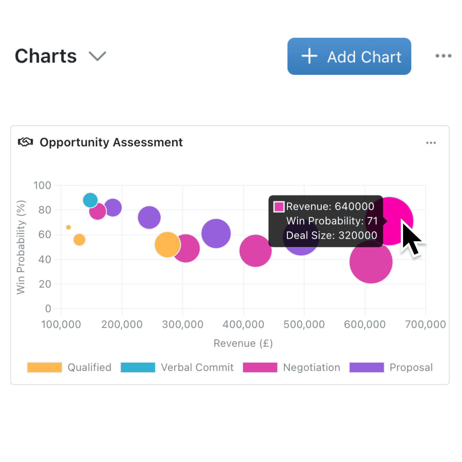
You can now create bubble charts on any dashboard or collection chart panel. Bubble charts plot records using three numeric fields at once: the X axis, the Y axis, and the size of each bubble. This gives you a richer picture of your data in a single, interactive chart. Bubble charts are available everywhere existing chart types appear, including the portal, multi-collection charts, document exports, and AI-powered chart suggestions.
Why it matters:
- Spot patterns across three variables without switching between separate charts or exporting data to external tools.
- Configure in seconds by selecting your X Axis, Y Axis, and a Bubble Size field from any numeric fields in your collection.
- Compare across collections using multi-collection chart mode, overlaying bubble data from different sources on a single chart.
How it works:
- Open a dashboard or navigate to the charts panel on any collection.
- Click Add Chart and select Bubble from the chart type picker.
- Choose a numeric field for the X Axis (horizontal position of each bubble), Y Axis (vertical position of each bubble), and Bubble Size (the area of each bubble scales proportionally to this value).
- Optionally, select a Categorisation field to colour-code bubbles by category.
- Save the chart. Hover over any bubble to see all three values, and click a bubble to navigate directly to its record.
When to use it:
- Sales managers can plot deals by revenue (X), win probability (Y), and deal size (bubble), instantly seeing which high-value opportunities need attention.
- Project leads can chart tasks by deadline proximity (X), priority score (Y), and estimated effort (bubble), helping teams focus where it matters most.
- Operations teams can map suppliers by cost (X), delivery time (Y), and order volume (bubble) to identify the best-performing partners at a glance.
Get started
Head to any dashboard or collection chart panel, add a new chart, and select Bubble to try it out. If your collection has suitable numeric fields, you may also see AI-suggested bubble charts ready to add with a single click.
If you have questions or feedback, we would love to hear from you.
Email support@kinabase.com — we're listening.